
…and when is data mining and analysis just a sophisticated, math-laden opinion?
I like to draw insight from juxtapositions. Yesterday, I listened to half a dozen academic presentations on modeling and data mining aimed at understanding the impact of extreme weather on global communities. As you might imagine, these exercises require large data sets, bold assumptions, and extrapolations, some out to as far as year 2100.
Later in the day, I sat at the piano with a blog post about Debussy’s Arabesque No. 1 for solo piano, a popular piece known for its “impressionistic” qualities. The author of the blog did some analysis on melody, harmony, and rhythm that essentially was trying to get into Debussy’s head as he composed this piece.
The blog author teased out a melody buried in some arpeggios and then attempted to show how it becomes a motif throughout the piece. She admitted she couldn’t really know whether this melody was Debussy’s intent, but made an assumption that this certainly could have been what was going through Debussy’s head.
The academic data mining and modeling would probably be scary to those who aren’t comfortable with numerical modeling and methods; the analysis of Arabesque No. 1 would probably be scary to those not familiar with musical notation and compositional methods. The assumptions and extrapolations made in both cases could make nervous anyone familiar with both.
In both cases, a “specialist” is trying to gain insight into something that, for all practical purposes, is unknowable – Debussy’s thought process (even if subconscious) as he composed Arabesque No. 1 and economic and community impacts as the planet warms over the coming decades – and then convince an audience that they’ve indeed shed some light into a dark cave. And if we are to take either analysis as useful, others would have to validate the findings, or otherwise agree on the methodology, results, and conclusions.
Moral of this tale: Analysis isn’t “new knowledge,” regardless of what kind of notation accompanies it, until many other experts weigh in and many analyses converge on similar conclusions. And just because someone has credentials that brand him or her a specialist, doesn’t mean their analysis is more than a sophisticated opinion.
What really astounds me about listening to academic presentations these days (which I have been doing my entire career) is how few people, usually experts with as much background and experience on the topic as the presenter, actually question the results or methodology. This to me is dangerous at its core. Academia is where data and findings should be vigorously interrogated and debated. These days, technical presentations in general seem to be more of an advertising opportunity than a spark for debate towards achieving some consensus and contribution to the knowledge base.
How I arrived at the Carbon IRA (individual retirement Account)
I’m thinking maybe a little more context is necessary for people to “get” the Carbon IRA (individual retirement account) concept and why my book, Carbon IRA + YouTility: How to Address Climate Change and Reduce Carbon Footprint Before Its Too Late, has such salient messages.
A chemical engineering education and electricity industry career pretty much makes you a systems person. You think in terms of systems, boundaries, and surroundings. After several decades in the electricity and energy sectors, and wrestling with the macro-carbon footprint challenge, I finally realized a few things weren’t going to change anytime soon:
- Economic growth is predicated on buying and consuming stuff
- Low cost energy supports economic growth
- Carbon-laden fossil fuels are the backbone of low-cost energy, especially electricity
- Therefore, carbon is the ultimate externality – the environmental impact that isn’t properly reflected on the accounting ledger
- Thus, until carbon-free energy replaces fossil fuels, we are doomed to aggravate carbon-induced climate disruption.
These aren’t immutable “truths” like the laws of thermodynamics. But they sure have been immutable in my lifetime. At least globally. So the “problem statement” is pretty straightforward.
When my two daughters were in high school and college, we had many dinner conversations about dad’s job (electricity industry) and climate change (what my daughters were having nightmares about). I kept saying, until everyone on the planet learns to consume less and we accelerate the transition to renewable energy sources, it will get worse before it gets better. And it has.
So we came up with this slogan. Think:Less! Note the double meaning. Think less, or simplify how you think about global climate change. Think about consuming less stuff. Period. End of Story. We even made a stack of bumper stickers!
Of course, no one really knew what the hell we were talking about. But it led me to the more important challenge. Environmentalists have been preaching the three Rs – reduce, recycle, reuse – in my memory ever since the first Earth Day in 1970. By the new millennium, that still wasn’t working.
After more dinner conversations, I had an epiphany.
- You have to reverse the growth-at-any-cost economic mantra
- One approach is to reward behavior and consumer choices which result in less carbon
- If you make the behaviors permanent, you can make progress on carbon and climate
- You can’t depend on volatile energy price signals to sustain these behaviors
- Converting the avoided carbon into money is a bona-fide incentive
- Putting the money towards a retirement account encourages a lifetime of better behaviors and choices.
Hence, the carbon IRA concept was born. It turns traditional economics inside out. Since nothing else seems to be working fast enough, maybe it’s time for a radical departure?
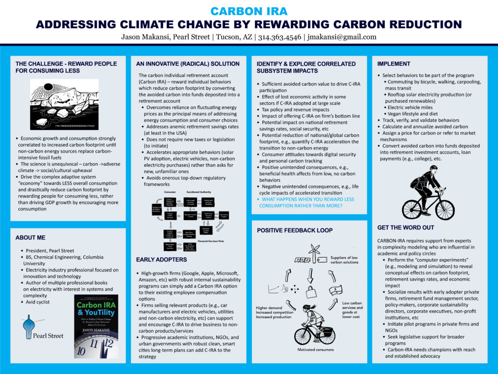
It was a honor to be selected to participate in the New England Complex Systems Institute International Conference on Complex Systems (ICCS2020) in July 2020 and present the Carbon Individual Retirement Account (Carbon IRA) concept. Here’s the poster I presented:
We need to bring error and uncertainty analysis forward in the public discourse. That’s what Painting By Numbers is for.
Consider these two statements.
- “Cuomo says 21% of those tested in NYC had virus antibodies”
- “Every 1% increase in unemployment results in 37,000 deaths”
The first is a headline in the New York Times April 23, 2020. The second is taken from a meme in my social media feed the same day.
In terms of numbers widely propagated and magnified in the public sphere, both suffer from a common deficiency. Quantified error and uncertainty bounds around the result are not reported. So, the public has no idea what the value of the numerical result really is.
Without a sober, quantified explanation of accuracy, validity, relevance, repeatability, bias, and certainty, both numerical results come across as sensationalist in their own way.
This gap is a constant source of misunderstanding for smoldering crises like climate disruption and social inequities but becomes dangerous, frankly, during immediate crises like the COVID-19 pandemic and the 2007-2008 financial crisis (lack of understanding of financial engineering models). Information, including results of countless numerical analyses, forecasts, and predictions, is disseminated fast furiously and peoples’ heads spin.
Memes propagated through social media aren’t going to improve in quality anytime soon. I understand that. I’m not going to even try deconstructing the unemployment meme.
But scientists, academics, political leaders, and journalists should be more careful.
It’s one thing to also report, or state from the podium, “these are early results and must be validated with more testing,” “preliminary results,” or “the testing method is still under development and is not 100% percent accurate.”
In fairness, a New York Times article about the 21% number does include many disclaimers. https://www.nytimes.com/2020/04/23/nyregion/coronavirus-new-york-update.html
The account does acknowledge that the accuracy of the test has been called into question. But what does that tell us? Not much. The article also takes the percentage and propagates it through another calculation, stating that “if the state’s numbers indicated the true incidence of the virus, they would mean that more than 1.7-million people in New York City…had already been infected” and “That is far greater than the 250,000 confirmed cases of the virus itself that the state has already recorded.”
So a numerical result with unquantified accuracy now implies that the infection rate is almost seven times higher than the confirmed cases. The error in the 21% number is now embedded in the next numbers!
Just because a bit of information is a number doesn’t necessarily mean it is telling us something meaningful, relevant, or useful at this time.
Determining and error or uncertainty is a rigorous, quantitative, analytical exercise and should be conducted for every numerical result, especially during times of manic public concern.
Many, though not enough, scientific journal papers at least will include a qualitative on error and uncertainty in the measurements, the models, statistics, assumptions, etc, especially around statistical analysis. Rarely do you see included in media reports a thorough answer to the question “how confident are we in the numerical result we just reported?”
We need to bring error and uncertainty analysis forward in the public discourse. That’s what Painting By Numbers is for.
I
It’s a memory that’s fading but for the first earth day in 1970, a popular DJ in Chattanooga, TN (one of two places I grew up), Chickamauga Charlie, and his radio station sponsored a city-wide cleanup. My family lived in what were then pretty remote suburbs, but I remember that day trudging through parts of the city I’d never seen before with kids I’d never interacted with before. We cleaned up city streets and vacant lots with the kinds of junk I’d only seen in the huge junkyard my dad occasionally went to for car parts. Change – and teenage optimism – were in the air!
For the 20th anniversary of Earth Day, I launched a monthly newsletter called Common Sense on Energy and Our Environment. My wife and I published it for six years but it really never took off. I learned something that would presage the bitter partisan divide America faces today: People paid lip service to the value of an independent, objective publication on controversial environmental issues, but they would only support one that advocated for “their side.”
For this 50th anniversary, my uplifting message is that reducing our carbon footprint shouldn’t be as difficult as people make it out to be. We can address half the carbon footprint challenge by the 70th anniversary of Earth Day or even earlier by implementing on two ideas:
- Create long-term or lifelong permanent incentives for individuals to reduce their carbon footprint (electric vehicles, biking or walking to work, meatless diet, rooftop PV, energy conservation, etc) by converting the avoided equivalent carbon into funds deposited in retirement accounts or other long-term financial obligations. I call this the Carbon IRA
- Allow electric utilities to own non-carbon distributed and on-site energy infrastructure for homes, buildings, and large facilities (solar PV, storage devices, EV chargers, smart thermostats, state of the art HVAC, etc); apply the regulated rate of return business model; unleash a new frenzy of responsible investment; and displace fossil-based resources with non-carbon.
Most experts agree that greater electrification based on renewables and nuclear, along with electric transportation, is the ultimate path (along with minimizing resource consumption in the first place). These two policy pillars will get us there faster, better, and less expensively. Along the way, there will plenty of opportunity for natural gas fired power plants, firing US sourced natural gas, to handle the intermittency of renewable energy.
We can convert electricity from climate disruption villain to climate solution hero!
As part of a larger US infrastructure rebuild, such a strategy can satisfy many seemingly conflicting political forces – globalism (address carbon-induced climate disruption), nationalism (focus on US infrastructure needs), rural populism (jobs, jobs, jobs), liberalism (yes, an industrial policy), and conservatism (incentives to change behavior, not laws).
Why do I say it’s not that hard? We built out the largest “machine,” the post WWII US electricity grid in twenty five years using the utility regulated rate of return business model and it now drives the entire economy (sadly, without appropriate recognition). Economists prove over and over again that properly aligned incentives can quickly and substantially change consumer behaviors.
All we need is the collective will to confront multiple emergencies – the ticking clock of climate change, the anemic retirement savings of most Americans, the indebtedness of many young adults, and the consequences of rampant global, unchecked, capitalist ambition, now staring at us every time we look in the mirror with our COVID19 masks on.
And guess what? We could again lead the world to a better place.
T
Shifts in language fascinate me. When did “reach out to” replace “contact”? The battle for hearts and minds often involves subtle nuances in language but deep changes in meaning. “Medicare for all” connotes something far different from “government-run medical system.”
For the first few decades of my career in electricity, reliability was the paramount performance characteristic and metric for the industry. Over the last ten years, I sense that “reliability” is being replaced by “resiliency,” perhaps not in the back offices of utility management and engineering, but in public discourse.
A few years ago, I heard a presentation by a power plant engineer who made this distinction with a boxing analogy: Reliability is avoiding the punch, resiliency is taking the punch.
I didn’t think much about it at the time, but I sure have thought about it a great deal since, and especially now in the midst of this COVID19 global pandemic.
There’s a subtle shift in meaning and design/operating philosophy implied here. The “grid” has always been over-built (gold-plated to some in other industries) to achieve very high reliability standards, to “always keep the lights on.” The goal was to avoid outages. This, one could say, is the core competency of a utility company.
Resiliency means accepting that outages will occur, and perhaps also means that the next catastrophic event will unlikely resemble the last one. In other words, you can’t design for the worst flood that occurred in the last 100 years, because the next one will likely be worse. You also design so that the critical parts of the grid can “survive,” and the non-critical ones can “recover.”
So rather than avoiding an outage, you design the system so that you can bounce back from an outage as expeditiously as possible. And you divide the grid into two buckets – critical and non-critical.
To me, this subtle distinction actually represents a sweeping change in attitude and philosophy. Rather than striving to maintain the overall grid serving everyone to be as robust as possible, you are now conceding that outages are unavoidable and some areas served by the grid are less critical than others.
Another way of looking at it is that reliability is the outcome and resiliency is the means by which you achieve reliability. From a Microsoft webpage about cloud-based services comes this: “Resiliency is the ability…to withstand certain types of failure and yet remain functional from the customer perspective.”
For electricity, I interpret this to mean something like this: a site standby power system takes over immediately when a grid tie failure is detected. It could also mean that the electricity grid is designed to withstand the worst catastrophic event we can imagine; however, I doubt there is ever enough money in the budget for that.
The COVID19 pandemic is causing all manner of reflection and projection, as catastrophic events tend to. An article by an emergency room doctor I read this morning in The New Yorker asked, “Will we be forced to shift the emphasis of our bio-ethical values away from our “do everything” approach. “The American medical system is focused on aggressive healing at all costs, sometimes in the face of medical futility to the detriment of the patient’s comfort,” the article went on, “Emergency rooms are the country’s safety net.”
Does this imply a subtle shift from avoiding a death “at all costs” to “facing difficult decisions” about who has to die. The former means having the medical resources on hand, a gold-plated system, if you will, to avoid death. The latter means accepting that everything you can do for the patient is now less than it was. Avoiding the punch or taking the punch?
Somehow buried in this replacement of reliability by resiliency, I fear, is that gold-plated reliability for everyone will be replaced by an acceptable level of reliability for everyone. Above that and you’re on your own. I hope I am wrong.
It appears we’ve accepted a future in which catastrophic events get worse and more frequent, and there’s less we can do about that. That to me is different than the mentality which prevailed from WWII to recently in the electricity industry– a period during which we built the greatest and most reliable just-in-time inventory system, one gigantic machine delivering 24/7/365 to everyone an essential service, the backbone of the economy.
It may all seem like an esoteric discussion but shifts in language have consequences over time.
Now here’s a excellent example of the importance of data frequency resolution! This New York Times article informs us about some ‘weird’ characteristics of the planet Uranus (apart from the juvenile fun you can have with the name).
But what’s even more fascinating, if you are a data geek, is the notion that Uranus ejects “plasmoids” (a blob of plasma and magnetic fields, responsible for a planet’s atmosphere leaking away) was formulated just recently after space scientists went back into thirty year old data taken during Voyager 2’s 1986 journey, increased the resolution of the data from 8-minute averages to ~2 seconds. They detected what’s known as an anomaly in the planet’s magnetic field. You have to click on the NASA blog post referenced in the article to find this graph, below. The red is the average line; the black is the higher time frequency.

The plasmoid release occupies only 60 seconds of Voyager’s 45-hour long flight by Uranus, but has led to all kinds of interesting informed speculation about Uranus’ characteristics, especially compared to the other planets in our solar system. This “60 seconds” reminds me of what I vaguely recall learning in an anthropology class in college about constructing an entire hominid from a single tooth. (I thought it was Australopithicus but I wasn’t able to quickly confirm that.). Obviously, scientists will have to further validate their findings, either with a follow-on trip to the outer planets, or other means.
But the story certainly is an interesting lesson in data science. And I bet the scientists were itching to say Uranus burps, or even better, farts.
In recent news reports on COVID19 pandemic, I’m glad to hear pundits and politicians refer to the electric utility model for emergency response. Utilities assist each other during major outages, sharing and moving personnel and resources to hard-hit areas, to keep the lights on and save lives. This has been a traditional part of utility operations for decades, and thankfully has survived the deregulation/competitive era which nominally began in the late 1970s. It’s part of utility culture.
At that time, many industries were eventually transformed by what is commonly known as neo-liberal/conservative economic and cultural philosophy which argued, in effect, that everything is better with competition and markets. The list includes trucking, airlines, natural gas, electricity, water, education, and health care. Given today the disparities in wealth, dislocations in resources, and the environmental issue of our time, global climate disruption, it’s easy to blame this philosophy for the ills we seem to be facing as a nation and society.
Maybe the better way to look at it is that this “strain of economic thought” has run its course and it is time to work within a new framework.
In my mind, that framework is the traditional regulated utility. The basic business model is the utility invests to expand and maintain its infrastructure to serve everyone in its “service territory” and a government entity, the public utility commission, sets a regulated rate of return on that investment. Approved operating costs are passed along to the ratepayer. This way, investors earn a fair return, the system is equitable to all, and rates are kept reasonable. While electricity prices vary around the country, there isn’t a person that pays a rate that is excessive to the value of the service.
Most importantly, this approach keeps things predictable enough so that utilities can plan on a multi-decade basis. This is critical for infrastructure businesses.
As I argue in Carbon IRA & YouTility: How to Address Climate Change & Reward Carbon Reduction Before It’s Too late, we could solve at least one half of our carbon discharge problem by quickly returning to the traditional utility business model, this time allowing utilities to own customer infrastructure – such as smart thermostats, efficient AC systems, storage devices and rooftop photovoltaic systems – which help optimize the grid for everyone.
Now, I’m not a health care industry expert but I don’t seen why this business model can’t be applied in the same way. Public and private hospitals compete for resources, segregating care based on who can pay, etc.; insurance companies adversarially fight to keep costs in check, and state government agencies struggle to create standards, fund innovation, and oversee the whole mess. Rather than debate the merits of socialism or capitalism applied to health care, why not a third way?
Consider each large health care organization (i.e., hospitals, doctor network, accepted insurance providers, etc.) a “public utility” and regulate the businesses’ financials and performance using a public government commission. It’s worked well for other “essential services.” Why shouldn’t it work for health care?
I don’t think anyone reflects on a personal health care event with the words, “Gee, that worked well!” And I don’t think anyone witnessing this morass called the COVID19 pandemic response is saying, “Damn: This is working really great!”
Market-based economics work best for new industries and innovation. Markets don’t work well for critical or essential services or commodities (that’s why commodity businesses tend to have three major suppliers and are reduced to an oligopoly). Markets work worst during crises, why you see price-gouging and hoarding.
Anyway, I’m glad the pundits and politicians are invoking utilities and their ability to collaborate for crisis response and perhaps will apply some of their processes over the long haul. Because what we are witnessing during COVID19, the lack of coordinated analyses, communication, response, could very well embarrass this country forever.
So much “painting by numbers” is done with numerical models. And the government is probably the largest consumer of such models. All models require assumptions, and as Commandment 2 in “Painting By Numbers” counsels, you must identify these assumptions to understand the results.
The need for assumptions gives policy-makers wide latitude to drive towards answers which support their policies. For example, the EPA under the Obama administration calculated the “social cost of carbon” as a value around $50/ton of carbon emitted. The EPA under the Trump administration managed to tweak the model so that the social cost of carbon (SCC) was more like $7/ton.
I wrote about this a while back in this space. Apparently, one thing you can do is select a different value for the internal rate of return (a financial parameter) in the model, according to a few references I read at the time.
Now here’s some fun: A paper I found surfing the web entitled “The Social Cost of Carbon Made Simple” shows one methodology for calculating it. By the way, this has got to be the most wrongly titled paper of 2010, the year it was published. There is nothing simple about it! Go on – click on it and read the first few pages. I dare you.
But the paper does acknowledge that a “…meta-analysis…found that the distribution of published SCC estimates spans several orders of magnitude and is heavily right-skewed: for the full sample, the median was $12, the mean was $43, and the 95th percentile was $150…” Moreover, the spread was as low as $1/ton.
See what I mean? If you want to de-emphasize carbon in your economic policies, you pick a methodology that minimizes SCC. If you want to build your policies around climate change, you pick a method that maximizes it. To the credit of the Obama administration, they settled on something close to the mean.
The paper is provisional work and nine years old, so don’t take it for any kind of gospel. I use it simply to illustrate points that require of the paper neither absolute accuracy or timeliness.
In an article (New York Times, March 27, 2020) titled “Trump’s Environmental Rollbacks Find Opposition From Within: Staff Scientists,” I read this: “In 2018, when the Environmental Protection Agency proposed reversing an Obama-era rule to limit climate-warming coal pollution, civil servants included analysis showing that by allowing more emissions, the new version of the rule would contribute to 1,400 premature deaths a year.”
I’m not going to dig deep and determine how they arrived at the number 1400, and anyway, the key to the sentence isn’t the number, it’s the word “contribute.” How many other factors “contribute to those premature deaths?
The article argues that Trump administration officials are not even trying to “tweak” the models, but instead have come in with a “repeal and replace” attitude “without relying on data, and science and facts.” It was reported that Obama’s head of the EPA, before she departed, had encouraged staffers to remain and make sure that EPA’s analyses have the “truth” put in there.
Unfortunately, numerical models don’t cough up the truth, just someone’s version of it. Those who don’t take the time understand all of this become victims reduced to parroting others’ versions of the truth. On the other hand, not even being willing to consider data and science and facts is completely wrong-headed. That is ignorance, as any model of human behavior will tell you.
Painting By Numbers: How to Sharpen Your BS Detector and Smoke Out the Experts earned Silver in the Foreword Reviews Indies Awards for 2016 in the category Social Sciences.
Recognition is always welcome, especially as an independent author through an independent publisher, and this latest award for Painting By Numbers sits alongside the GOLD IPPY won in the 2017 Independent Publisher Book Awards in the category Current Events: Social Issues/Humanitarian.
To everyone fighting numerical illiteracy, we salute you!

